h&r block
Overview
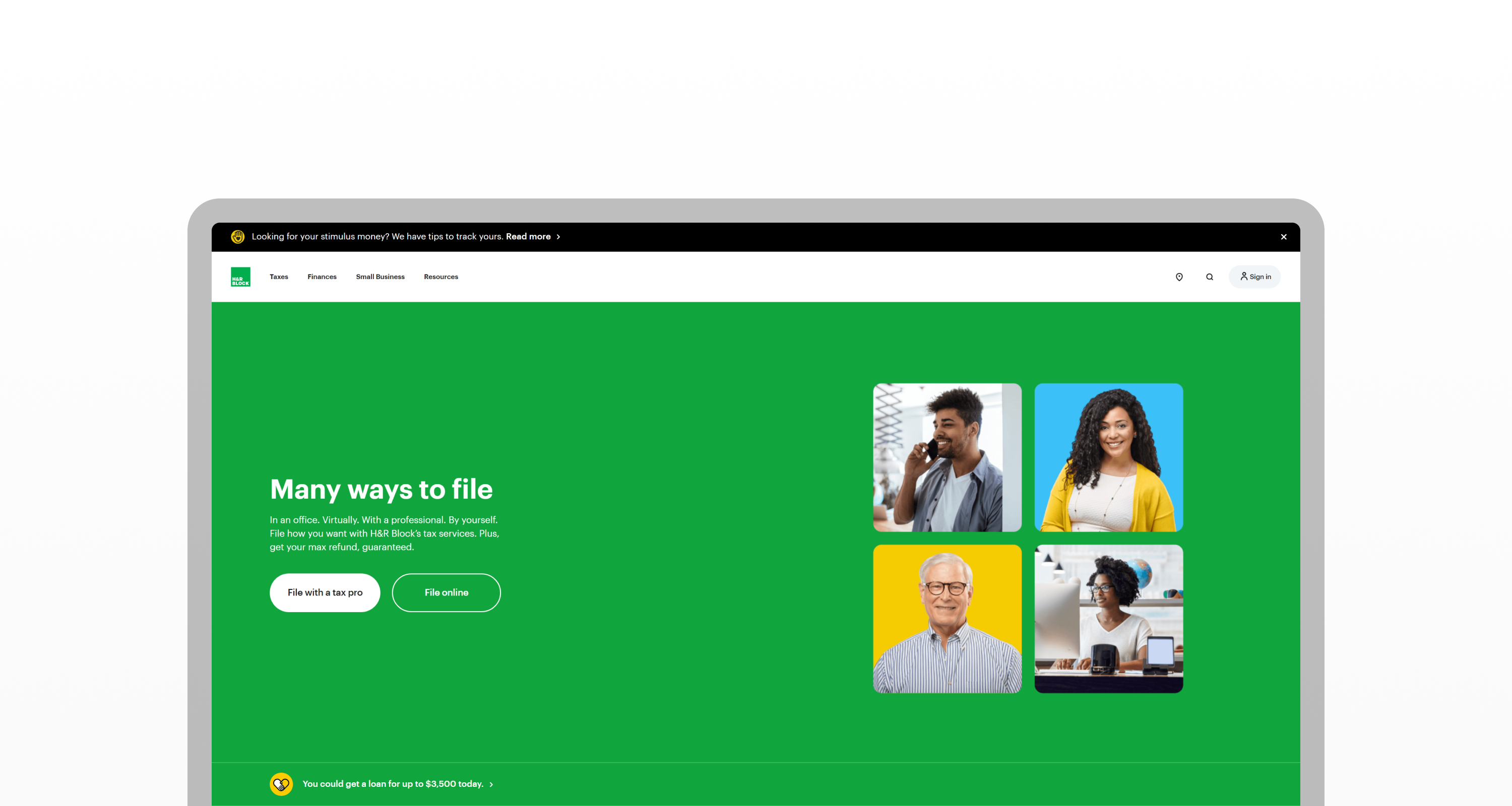
See it live at hrblock.com.
H&R Block is one of America's largest tax preparation company offering services from tax professionals, consumer tax software, online tax filing, and more.
Work & Co was tasked to help redesign H&R Block's web properties/products, and my role was to support the team via managing the design system in Figma, produce responsive versions of pages & components, and creating high fidelity prototypes for developer handoff.
Design System
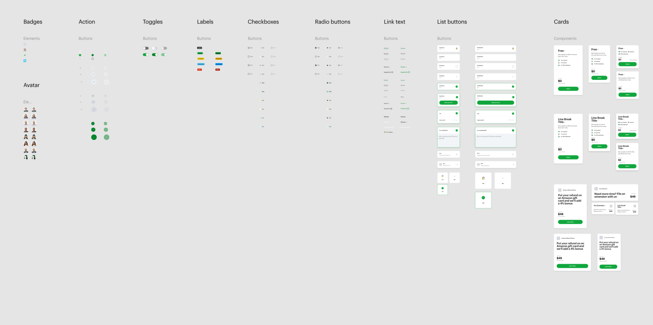
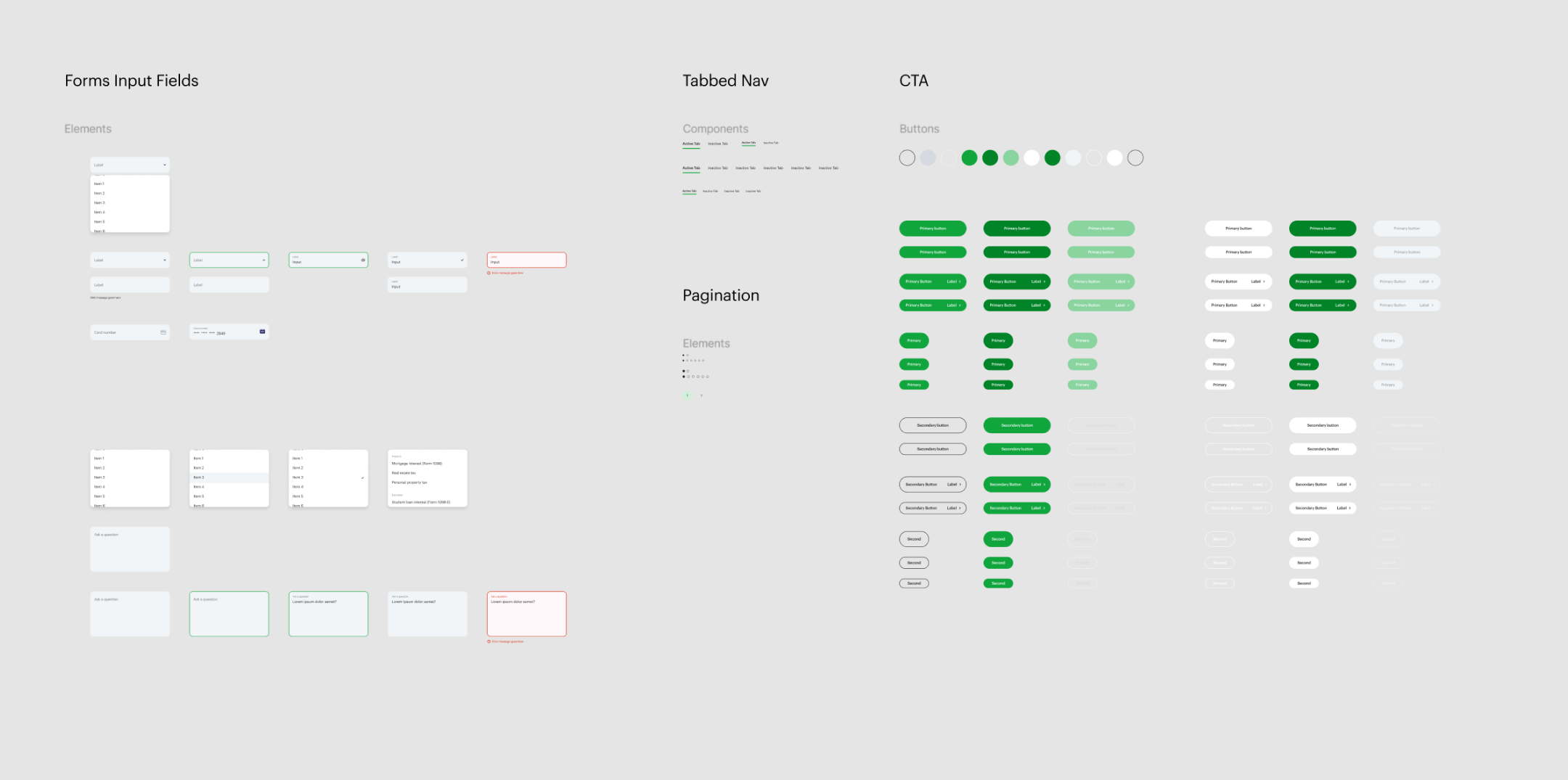
comprehensive system
The large scope of the project required a large amount of different components to be organized within the system, and to better ensure consistency across all applications, each component had special variations for desktop, tablet, and mobile where appropriate.
solving complexity
The CTA buttons were a huge pain to work with due to the sheer amount of variations for not only the size, but also it's color, state, and use case.
I created a solution that focused sorting by the most commonly sorted variable—the size—and flattened any unecessary grouping by clearly identifying each variant in the name itself.
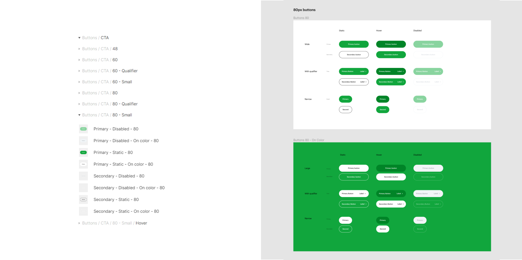
The introduction of this new system greatly helped reduced confusion and improved efficiency for everyone using the library. Due to the success of the implementation, this methodology was applied to the rest of the design system both retroactively and moving forward.
Accessibility challenges
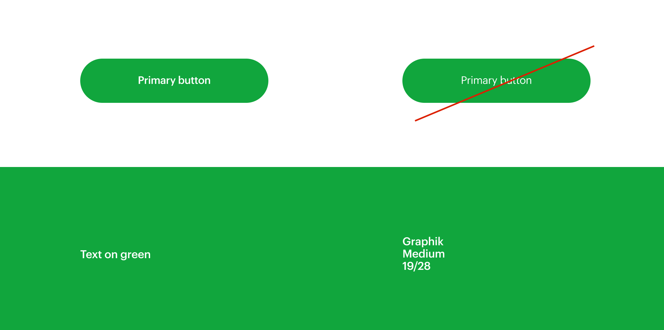
As H&R Block primarily uses green for it's brand, multiple considerations needed to be done in order to ensure everything we made was AA compliant as H&R Block serves a huge range of users.
Importantly, we found that any white text on green must have a font weight of medium, and at least 19pt in size. This was a compromise we had to do despite working in a base 2 grid, and it lent itself to multiple challenges in the design process, especially in responsive sizes where the sizing can become unwieldly.
Prototyping
Detailed Interactions
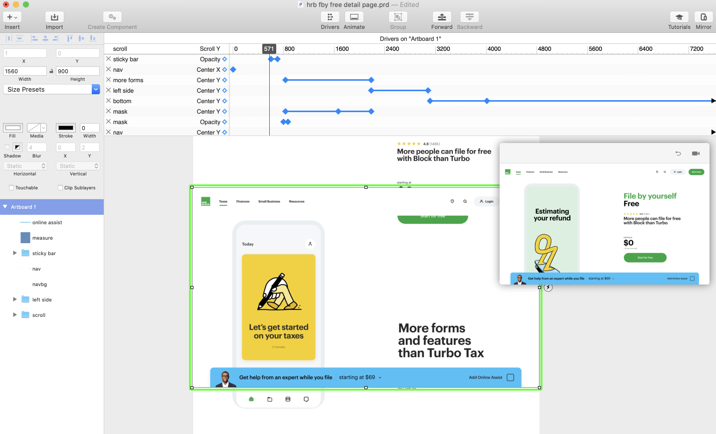
To help with implementation, we produced high-fidelity prototypes in Principle for just about every interaction we had envisioned, including any responsive variations that may affect the behavior.
Takeaways
Result
- A system that served both designers at Work & Co, H&R Block, and developers on the project.
- Organized naming scheme for a more efficient workflow.
- Flexible structure to accomodate new contexts.
- Accessible components that are AA compliant.
Learnings
- The system is a living document that grows and evolves based on usage and feedback from people using it.
- Don't be afraid to call out deviations in crits to catch edge cases early or to educate others of known patterns.
- 2 amazingly helpful plugins for finding/correcting inconsistencies: Style Organizer and Reattach Instance.
- Keep learning, with a myriad of options and 'hidden' features in Figma, I was constantly experimenting with different combinations and ways to cleverly create components that were as straightforwardly easy to use as possible.