Subi Food
Overview
Subi is a platform that allows food lovers to visually share and discover new food choices based on their own tastes. The appearance of food heavily influences our perception of a tasty meal, and Subi is designed to present that upfront.
Scenario Video
Interaction Highlights
Inspiration
You've just gotten a break from work, or from class, and you really want to just go out and eat something. Time and time again, you're met with the same burning question: "What do I really want to eat?" You sit there, burning through Yelp!, Instagram, anything, and yet you just can't quite grasp what it is you want from looking through places and menus.
10 minutes have now passed, and you simply decide to just go to that taco truck right around the corner that you always go to instead.
People have trouble deciding what it is they want to eat, yet they want something new every once in awhile and they need to know in a timely fashion. This is what I'd like to solve.
Project Focus
Behavior
Study existing user behavior and points of friction.
Feedback
Document users to refine and further iterate.
Prototyping
Hone high fidelity micro-interactions and behavior.
Research & Analysis
User Interviews & Observations
All participants place the highest value in seeing visual imagery first, otherwise it is discarded. Secondary priorities are considering other factors such as reviews, distance, and pricing.
Summary
- Aspires to trying out new places.
- Likes to eat at regular places out of comfort.
- Photos of food help decide faster.
- Likes to see whats popular or trending.
Insight
- Users want to explore and try out new stuff.
- Balance between suggesting old and new places.
- Surface critical information faster.
- Being able to see what's popular/trending.
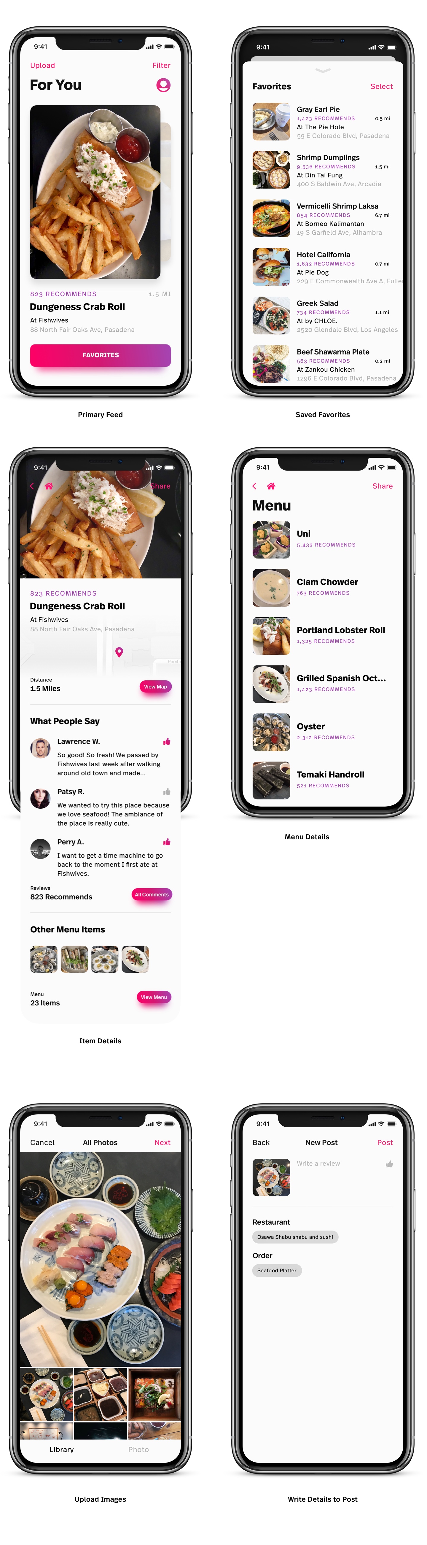
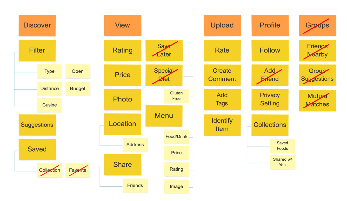
Structure
Information Architecture
By categorizing information, I can understand what kind of information should be presented to the user in different states of the product. Later revisions of the IA consist of simplifying the structure by discarding redundant information and/or features that are either out of the scope of the product or does not serve to enhance the product's value.
Wireframe
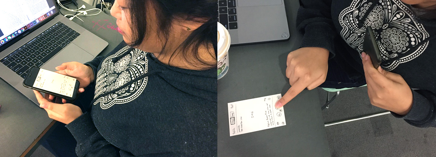
Wireframes were first created out of pen and paper to allow for faster iterations. Multiple versions of a particular screen were created to explore different ideas. The most promising one was made into a paper prototype. These prototypes were tested for its ability to communicate key information and logical flow between sequences.
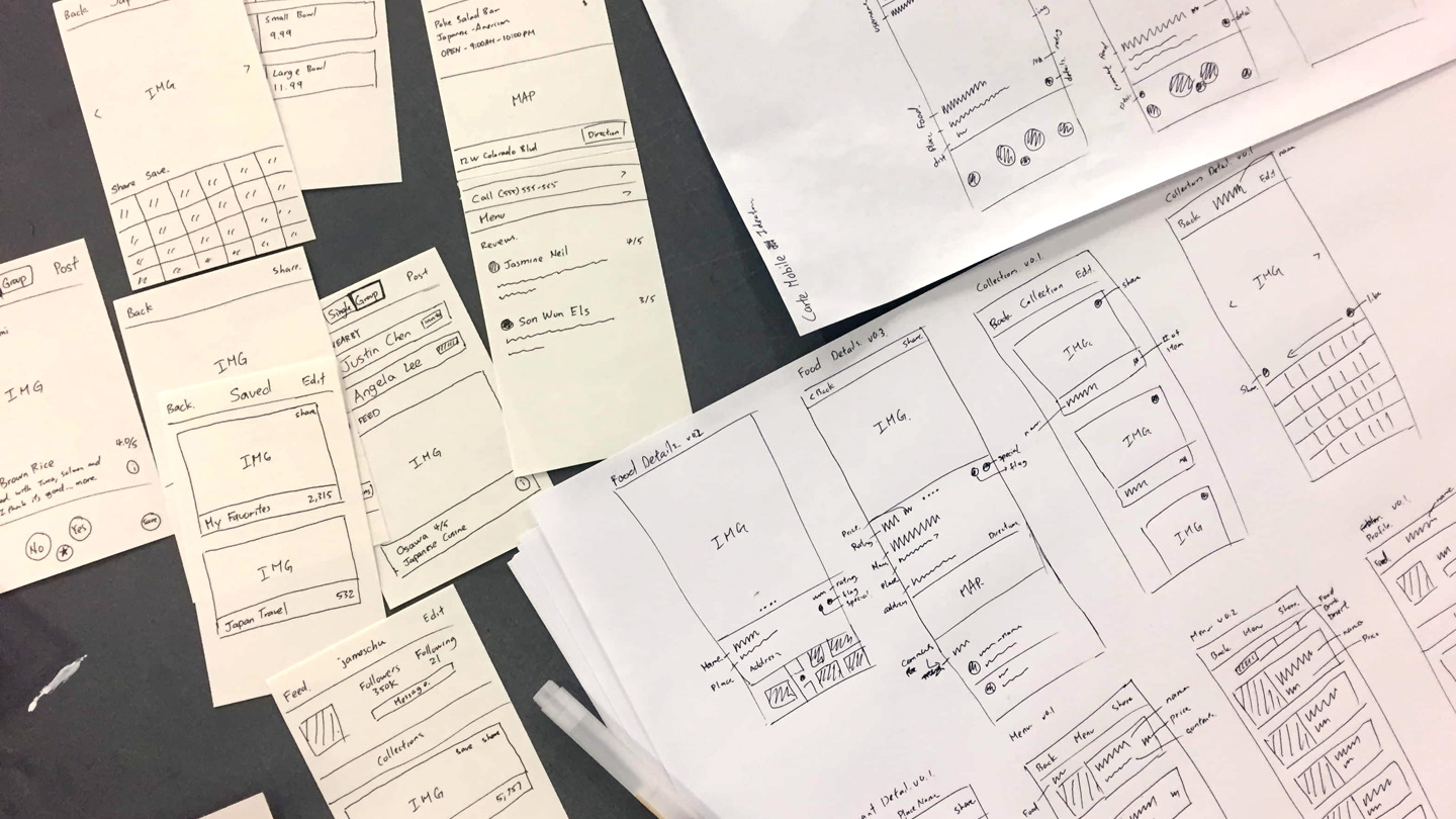
Key Learnings
- "Like" and "Save" are confusing for the user.
- Would like more information about a restaurant.
- Friend interactions are too obscure.
- No place to see notifications.
Adjustments
- Provide better distinction, and naming for "Like" and "Save".
- Streamline information in restaurant details
- Downplay social features as it detracts focus.
- Determine necessity of notifications due to change.
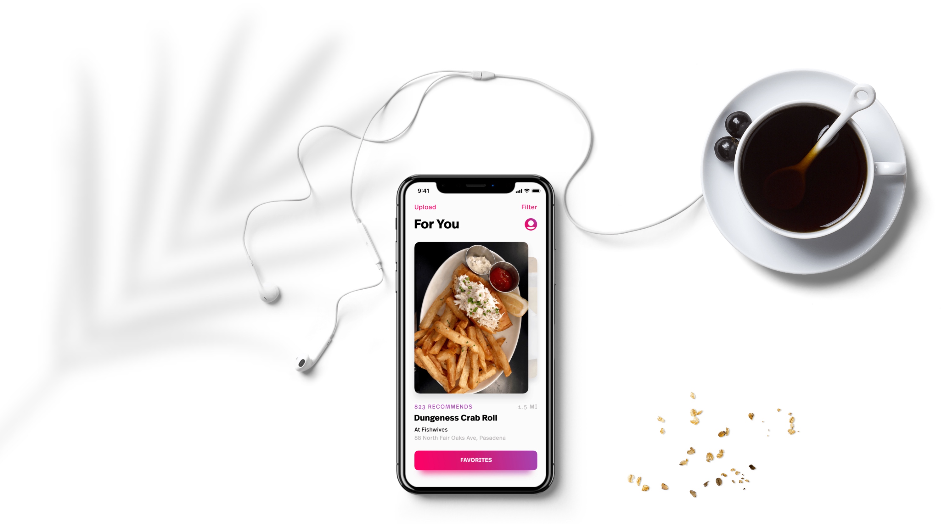
Visual Design
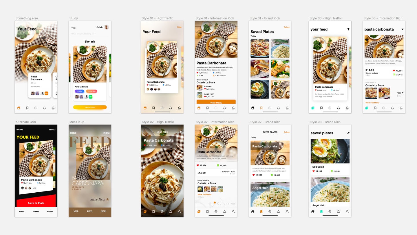
Design Explorations
The design of the product is where it becomes really intricate. With a food app that helps people discover new things, I wanted the product to feel bold, vibrant and fun to use. These were my 3 key design guide words which will inform the direction of my design.
Interaction Design
Interactions
Flow and fluidity were one of the primary goals of designing the interactions for Subi. Every transition and micro-interaction were tuned to empower the user to navigate naturally through the experience as an extension of their mind.
Prototyping
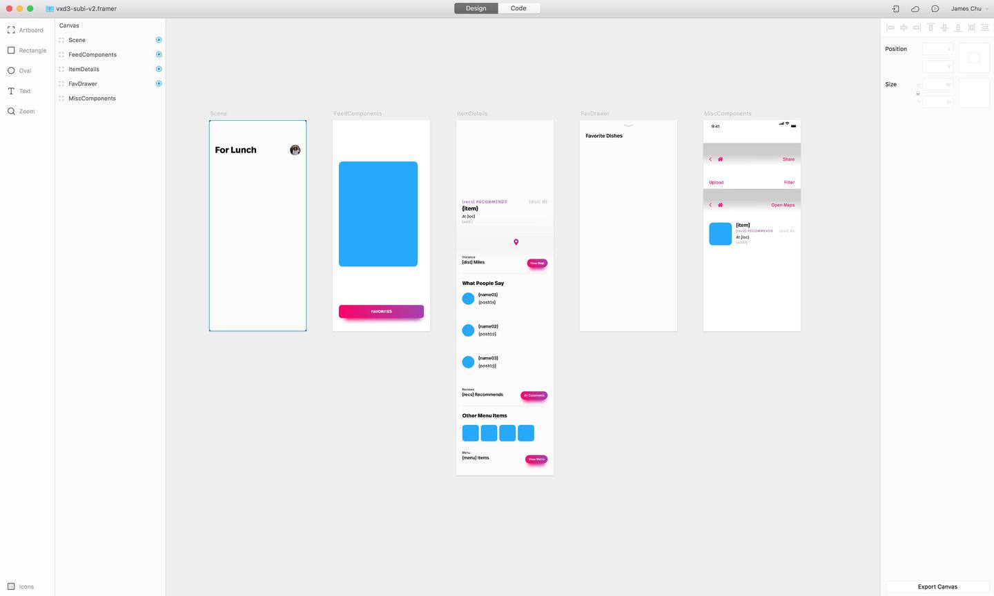
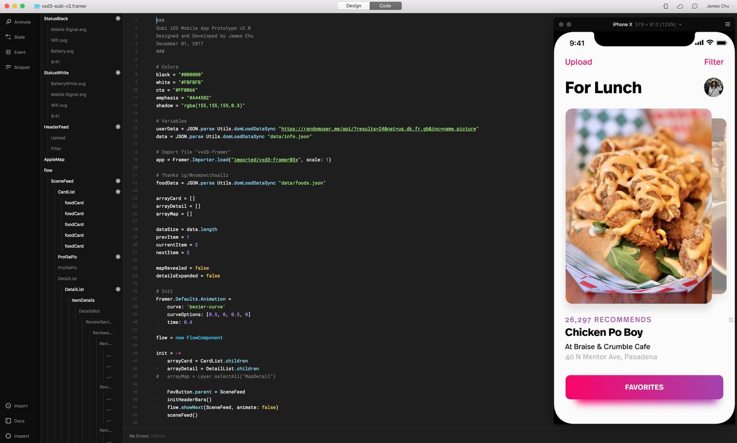
A large portion of the app flow and interactions were created in a single Framer project. By utilizing Framer's new Design feature, I was able to create and reuse components by templating information within it from a .json file. What this means is I can create as many pages/items as I want just from adding items to a .json file instead of designing different screens with different information. This allows for every single card you see in the main carousel to have its own detailed information page and I can add more just as easily.
Outcome
The final design cover's most of the primary use case and scenario's for Subi. By constantly revisiting the scope and goals of the product, I was able to contain much of the experience in a very small amount of screens by enhancing the value of each respectively.