TEDxACCD Website
Overview
TEDxACCD is a bi-annual event uniquely led by students to create passionate conversations within the community by sharing and spreading ideas intersecting in technology, entertainment, and design.
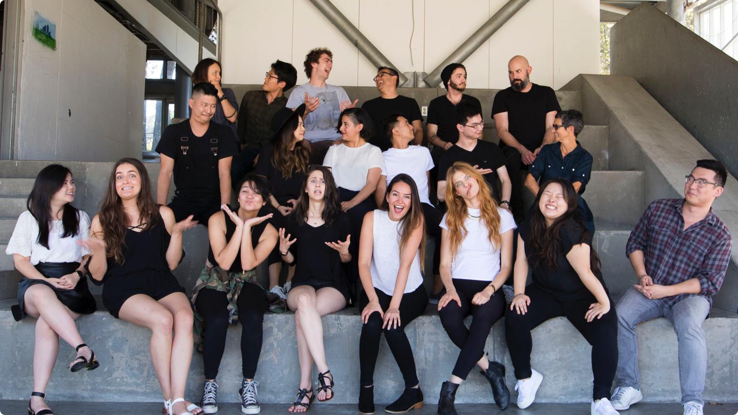
I joined the student team as the primary designer and engineer for the event website. As part of a 20 person team, I worked with individuals from various backgrounds to deliver the best TEDx experience at ArtCenter.
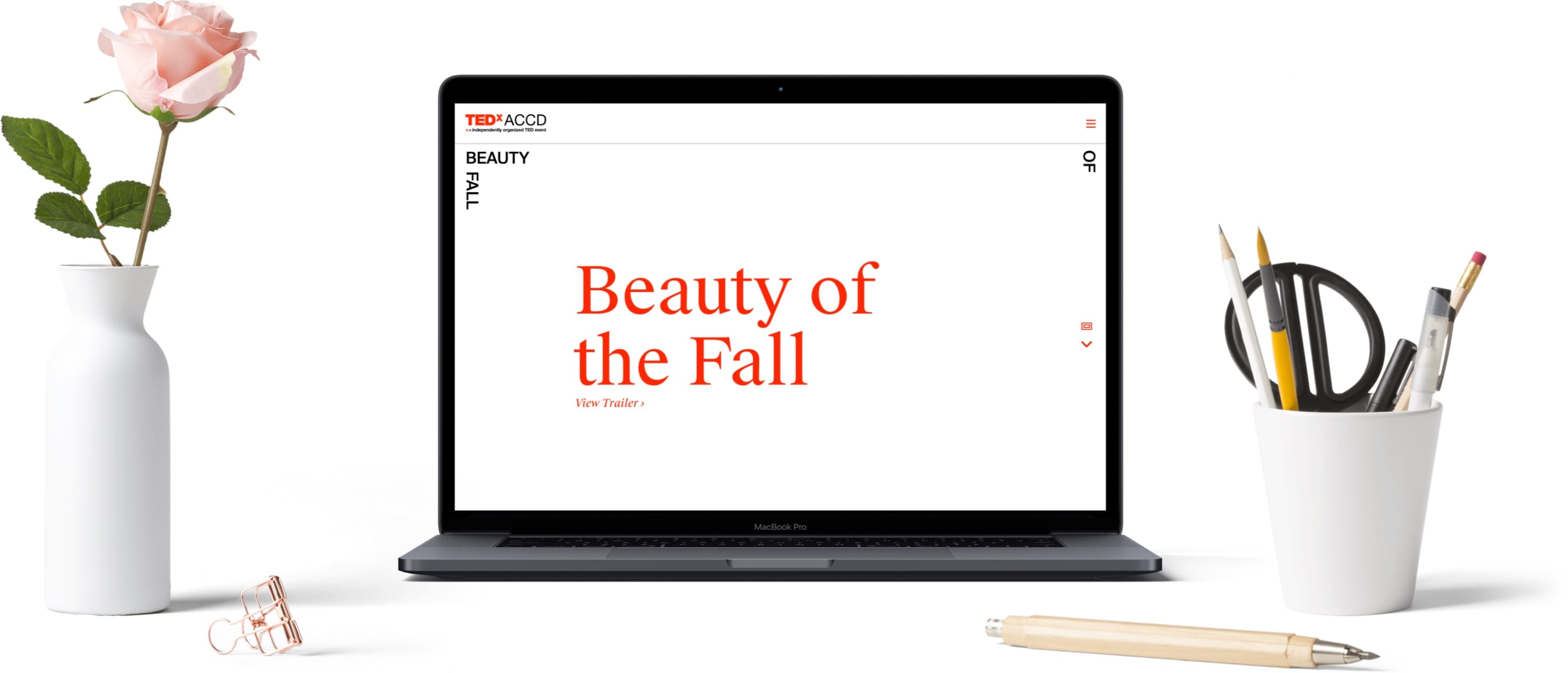
The live site can be viewed at 2017.tedxaccd.com.
Challenge
We needed a site up and running in 5 weeks.
With the event due to launch soon in November, we needed to be able to start getting the word out and have an online hub of information.
Role
Being the only Interaction Designer on the team, time and resources were scarce. With the inclusion of Graphic Designers Yuma Naito and Josephine Law, a sub-team dedicated to just the event page was formed.
My role involved drafting up the wireframes and layouts, creating the final mockups and developing the site for launch. With frequent feedback and idea's bounced between us along the way, everyone had a hand in the final product, while I made sure we stayed on track to deliver the best possible user experience.
Yuma Naito and Josephine Law would assist me in exploring various visual designs and aesthetics for our final product. Yuma, with his amount of design experience, would help shape and direct the foundational design which we will build upon.
Project Focus
-
Leadership
Implement SCRUM and Kanban strategies to deliver project on time. -
Fighting for the User
Compromise with teams were needed, but the user must come first. -
Growing the Team
Educate and inform my team of key user-centric design principles.
Research
Past Data Analytics
Based on site analytics and ticket sales in the 2015 edition of the event, we set our primary target audience to be approximately 50% students/alumni, and 50% the local community in Pasadena.
Feature Prioritization
Must Have
- Easy access to Speakers and other key resources.
- Modular design for unexpected design changes.
- Individual user profiles for easier hotlinking.
Could Have
- Single-page layout design.
- Integrated ticketing system.
- Newsletter system.
Will Not Have
- Large amounts of assets and elements.
- Individual user accounts.
- Dynamicly streaming resources.
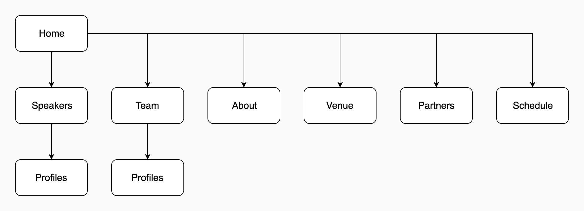
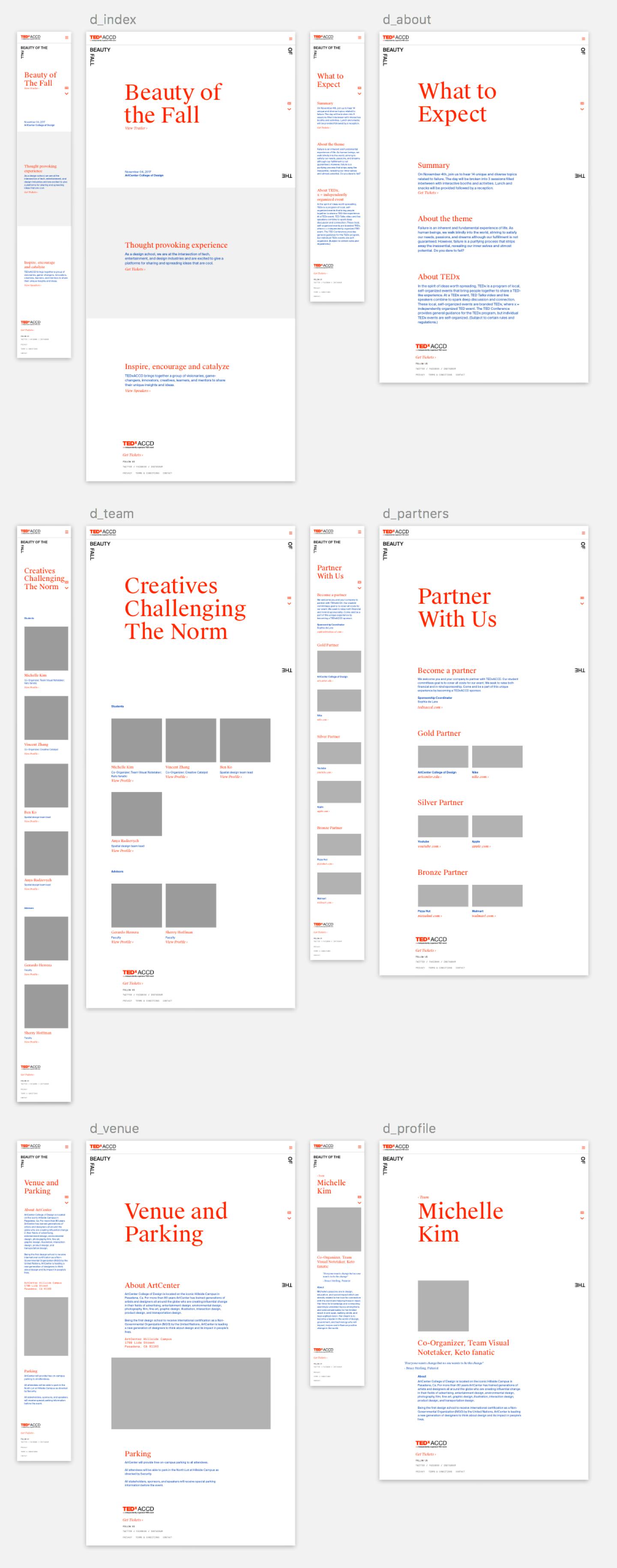
Navigation Structure
After doing some research on user behaviors in the 2015 site (which was a single-page design), on top of consulting with the project leaders on what kind of content and usage we're anticipating, I decided on having a multi-page site as the best way to present the amount of information we needed to convey.
Pen and Paper Wireframes
Learning from my past experiences, I approached wireframes differently this time around. Instead of creating high fidelity digital wireframes, I stuck with the good old pen and paper. This can be attributed to 2 reasons:
-
Iteration Speed
With just a week to finalize the wireframes, paper wireframes were fast to iterate, and more time could be spent on the user experience over wireframe aesthetics. -
Don't Over Design the UX
Wireframes that ultimately resemble a final product leaves little room for the visual design to grow. Perhaps I don't get it yet, but this article on Medium resonated my past frustrations.
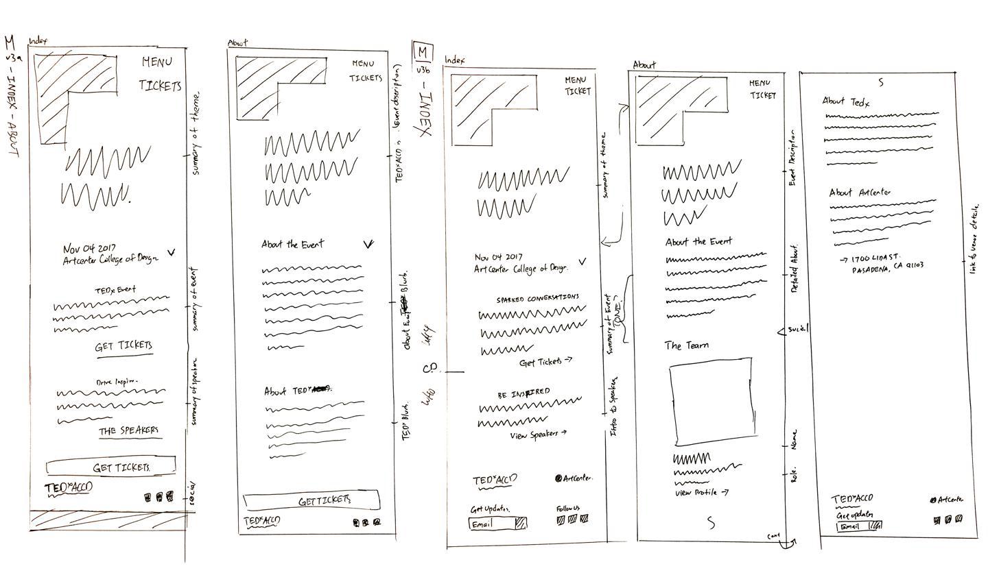
Mobile First
The layout was sketched with mobile first in mind including details on all necessary site content/copy. Everything would be checked off by the organizers and marketing team to ensure we're on the same page.
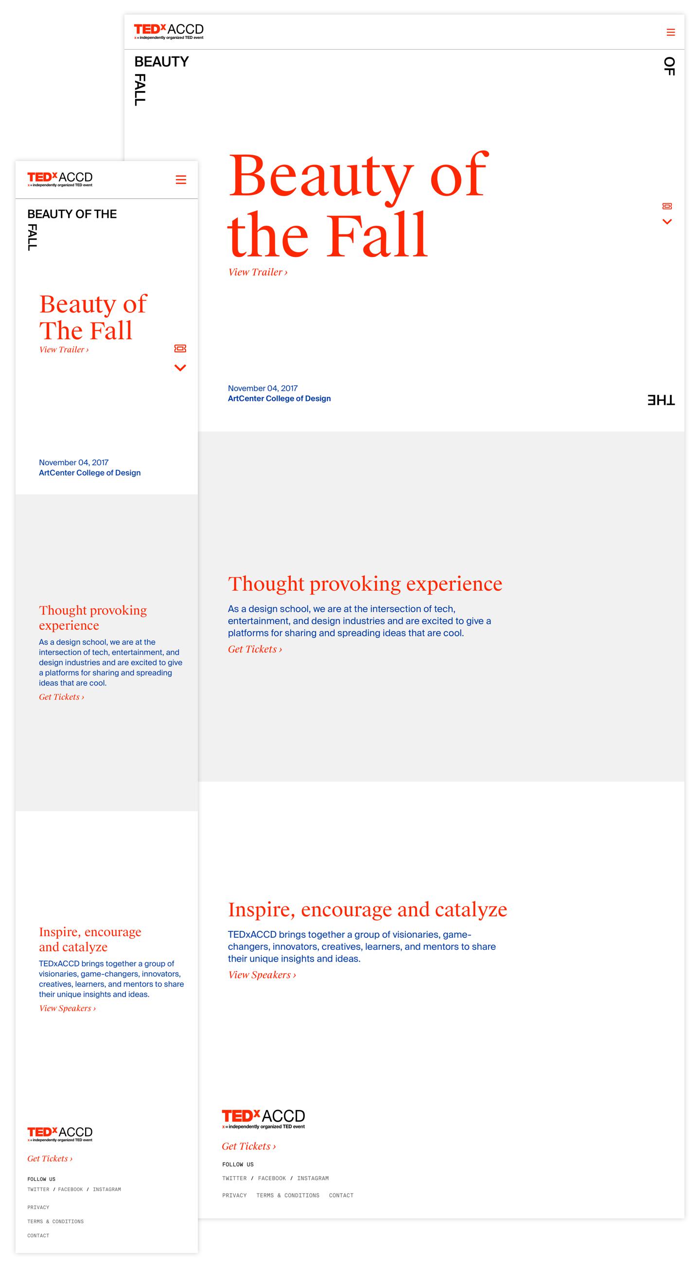
Visual Design
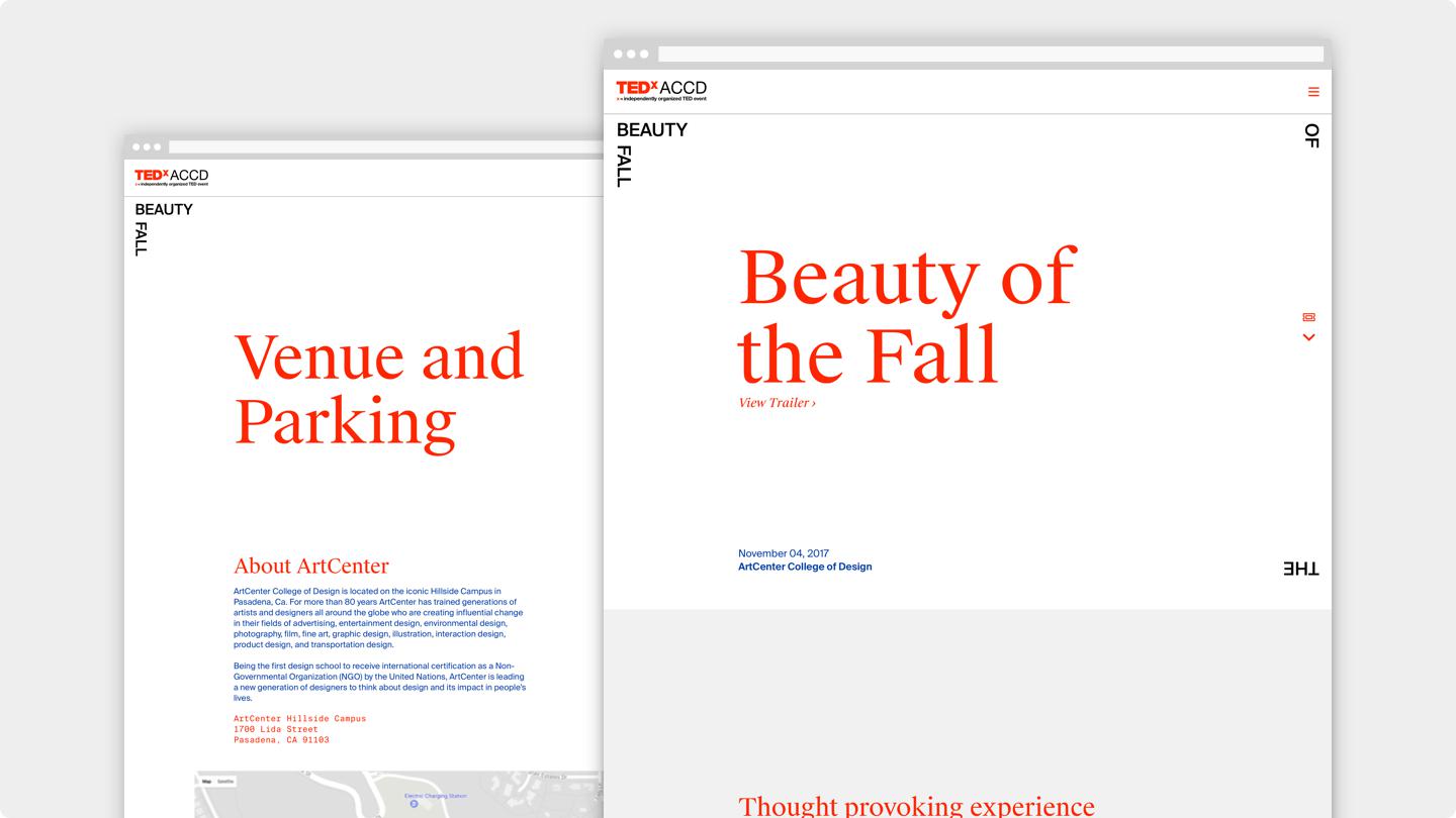
In order to follow a unified language, the Graphics team has created a brand style guide for us to use as reference. An important part of our brand was to tailor the design to each medium, and thus me and my team took some liberties to craft a unique experience that was still inline with the values and key aspects of the identity.
Yuma Naito assisted in creating a unique visual language based on bold typography and colors, along with Josephine Law who excelled in pushing the envelope of common design practices. I would later utilize their work as a foundation to the design along with their feedback and ideas to create the final design mockups for development.
Adaptability
While the design may seem overly dependent on text, this was a decision made in order to allow for maximum adaptability in the future. With the Graphics team heavily focused on production of other assets for the event, imagery and graphical resources for the website is lacking. By replying mostly on text, we allow room for the design to grow and incorporate images in certain areas, as well as account for any sudden need for additional sections or features.
Micro-Interactions
To further enhance the user's experience, I took care to implement various little interactions for users when they scroll, hover or click through the site. To ensure that these bits of animation don't hinder any aspects of the interactions, I made sure that they lasted only for about 200–500ms and rigorously tested their repeatability to not feel distracting or slow.
Development
Thanks to preparation I had done beforehand, I was able to develop and launch the site in the 3 weeks left. While I won't dive too deep on this process for now, I did my best to keep with common industry best practices and standards when developing the product, to be as close to experiencing a "real" developer's workflow when possible.
The entire source code for the website can be found on my Github Repository.
User Testing
With the preliminary designs and development work finished, we reached out to 19 users and had them go through the website with minimal instructions with the objective of finding all the information they may want to know and any other feedback/opinions.
The feedback helped tremendously as it was a relief to know there weren't major usability issues, I was rather shocked that there were a lot of comments towards the typography on the page. After taking account of the multiple responses, I assessed them carefully.
I maintained a detailed and thorough change log throughout the entire project, and many of the changes from testing are reflected in that document.
Outcome
With a tight deadline of only 5 weeks to bring a website from conception to production, we were able to hit the mark and deliver on time.
Over the course of the event, we attracted over 3,000 visitors, 7,500+ page views, with a bounce rate of ~67%, some of which may be attributed to the external ticketing provider we used. The most viewed page (not including the index) was our speaker lineup accounting for 16% of total page views.
Key Learnings
-
Can't Win Everything
Working with a lot of talented individuals can be a challenge. Learning to trust each other's judgements and compromising when necessary becomes important in working with others to reach new heights. -
See the Big Picture
Being at the frontlines of design can be exhausting, and I realized sometimes stepping away to get a 2nd opinion can really open your eyes to see things that are easily missed. -
Do the Right Thing
At first, as I took a more passive role, I realized simply waiting around would achieve nothing. After having conversations about my plans and ambitions, I would be put in charge of a small "web team", and that's how everything came to be.